|
Before you begin, you're going to need at least the following:
Note that I can't help you in getting any of these! You can also read this document with no words.
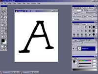
In photoshop, start up a new document. The height width ratio should be around 1.25 to 1. (I usually use 375 by 300). This should be an RGB or greyscale image, though you can also get away with B&W. I usually draw the letters directly in photoshop using my drawing tablet with one of the larger hard brushes. I set the tablet pressure to correspond to size for the paintbrush, so I can draw different weight strokes. Then I draw the letter, just getting the basic form down. Not many people have drawing tablets; here are some alternate ways of getting your letter images:
Once you have a letter image, copy it to the clip board by pressing control-a (select all) and control-c (copy). Open or switch to Fontographer. You want to make a new font by going to File... New Font. Double click on the letter A (or whatever letter you started with) and you will get something like this:

Fontographer (enlarge) You're now editing the letter A. Paste the image which you copied from Photoshop into the template by pressing control-v. Often you'll need to resize and move the image so it is the proper size and in the proper position. When resizing, hold down shift as you drag the corner dots; this ensures that the aspect ratio of the letter remains the same (it won't let you stretch it more or less vertically than you stretch horizontally). That looks something like this: 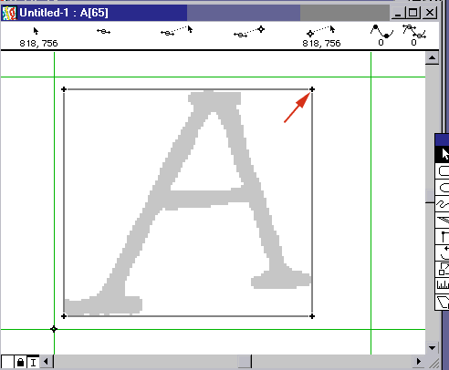
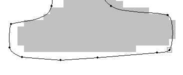
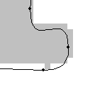
 Now would be a good time to press control-s to save. Save often and compulsively, because it is painful to lose work. OK! At this point, you could export the font and have a working but bad font with just the letter A. You could make the whole font like this but I don't recommend it. With practice, you'll be able to see spots where the autotracer did not do a good job and fix them. I've circled the problem spots below: 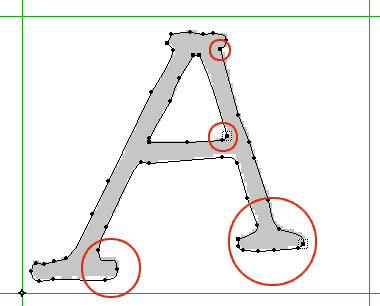 Let's fix the problem spot at the top first. I used the zoom tool (click the magnifying glass -- as far as I know, there is no shortcut key for this) to zoom in approximately on the area I circled: 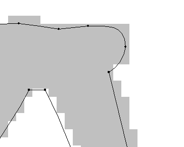 I don't like the roundness of the right serif, and I especially don't like a corner point (these appear as squares) being used instead of a curve, which is what I meant when I drew it. I select this point with the arrow tool and press control-8 to turn it into a curve point: 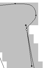 Now I adjust the control points (the little lines sticking out of the point). It's usually best to make curves by placing a curve point at the tip of the curve, with control points approximately tangent to the curve at that point. (This means that if you drew a line perpendicular to the line formed by the control points, it would be orthogonal to the curve). Often the auto curve command (control-shift-u) is good for doing this, or at least getting started. Finally I move points around to do the same sort of thing for the curves at the edges of the serif. This will render into a much nicer serif. 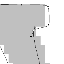 (finished) Now to the second problem spot, the bottom right of the inner triangle. I don't like the use of a corner point here either, since it is supposed to be a curve, and (somewhat ironically) the corner is not severe enough: 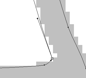 I use the same technique as above, moving the point so that it is at the tip of the curve and then adjusting the control points. Note that this is practically a corner point... a corner point could probably do, but I don't like 'em unless the font has a square or angular look. This font is supposed to look hand-drawn, and practically nothing hand-drawn has really really square corners: 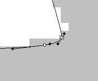 (finished) The bottom left problem spot almost looks how I want it, but the curve relies too heavily on its control points and not on nodes (curve and corner points). A good heuristic is to consider drawing straight lines between the nodes -- in this case it looks nothing like a serif. I've adjusted the points to the familiar tip-of-the-curve positions; now straight lines would at least approximate the serif, and this will usually produce a more accurate image.
 Finally, I do the same sort of thing for the bottom right serif, which is just generally untidy: 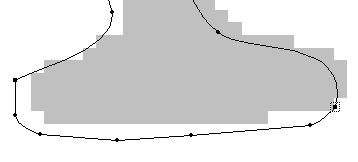 (before)
Now press control-t to zoom back out, and adjust the width of the font by dragging the right green line over to where it belongs: 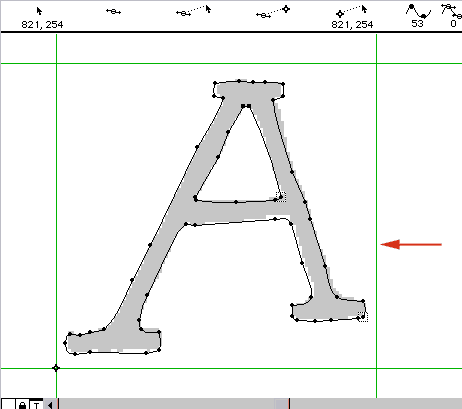 Press control-k to bring up the kerning dialog (which gives a good way to preview how the font will look. I think it looks fine: 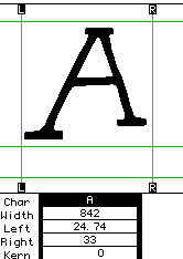
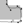
Now we have a pretty good font; the points have been hand-tweaked and it will look great at large sizes or on a laser printer. I've stopped a lot of fonts at this point. However, fonts which are particularly unmessy and have many straight segments are prime candidates for hinting -- a process which will make them look much better on the screen at small sizes. Fontographer does a pretty good job of hinting automatically (especially if you have your nodes in the right places), but it can be improved. In the layers box that you used before, click the X mark next to hints and select that layer. (Note: don't hint until you're done moving points around, or you will have to rehint if you need to change something.) 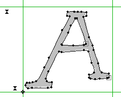 The point of hinting is to find horizontal and vertical stems in the font (and sometimes diagonal ones), and store their widths and locations. In Fontographer, hints appear as arrows on the top and right sides of the character. First, select all the arrows that are already present (Fontographer's guesses), and hit del to delete them. Now, for each horizontal stem (there are four in this font: the top serif, the crossbar in the center, and the two serifs on the bottom), select a point at the top and at the bottom which best define the width of the serif. (Select multiple points by holding down shift as you click, or by dragging a box around the two points). Now press control-shift-h to make the horizontal hint:  Repeat this for the other horizontal stems. Here I show all the hints and the points I used to generate them (note that you can't do multiple hints at once; this is a kind of contrived image): 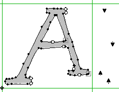 There are no vertical stems in this character, but to make a vertical hint you do the same thing and press control-shift-v. Occasionally, you will want to add diagonal hints to fonts. Sometimes this actually makes the font look worse, so exercise caution. To make a diagonal hint, select four points, two at either end of the diagonal stem. Then press control-shift-d. This is difficult to get good at; here is how I made the diagonal hint for the right stem: 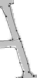 Now you can close this character and repeat the same procedure for the rest of them. When you're done, you should do the following before generating your font:
Now you can generate a Truetype font! Go to File... Generate Font Files, and generate! The Easy options should be sufficient. The last thing you might want to do is rename the .ttf file and use Microsoft's Font Properties Editor to edit the font's information. Hooray! You're done!
|
 You just have a template to assist you in creating the font, not any
actual font data yet. Fortunately, Fontographer can make some lines and
dots for you. Press O or select Outline from the layers menu.
This is really important because you can do this on the Template layer too,
and it will look like it worked except it won't. Press O and make
sure you're on the outline layer. Now press control-shift-t or
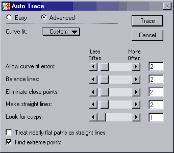
select Auto Trace from the Element menu. Here are the settings
that I use for autotracing. You might want to play with these, because they
can give you drastically different results, or you might want to use mine:
You just have a template to assist you in creating the font, not any
actual font data yet. Fortunately, Fontographer can make some lines and
dots for you. Press O or select Outline from the layers menu.
This is really important because you can do this on the Template layer too,
and it will look like it worked except it won't. Press O and make
sure you're on the outline layer. Now press control-shift-t or
select Auto Trace from the Element menu. Here are the settings
that I use for autotracing. You might want to play with these, because they
can give you drastically different results, or you might want to use mine: